The company approached POP during 2018 to begin the process of creating a new identity, guidelines and a new website. Following a process of internal and external research, we identified elements of the company’s existing identity that had enough value to retain and evolve and which elements needed to change completely.
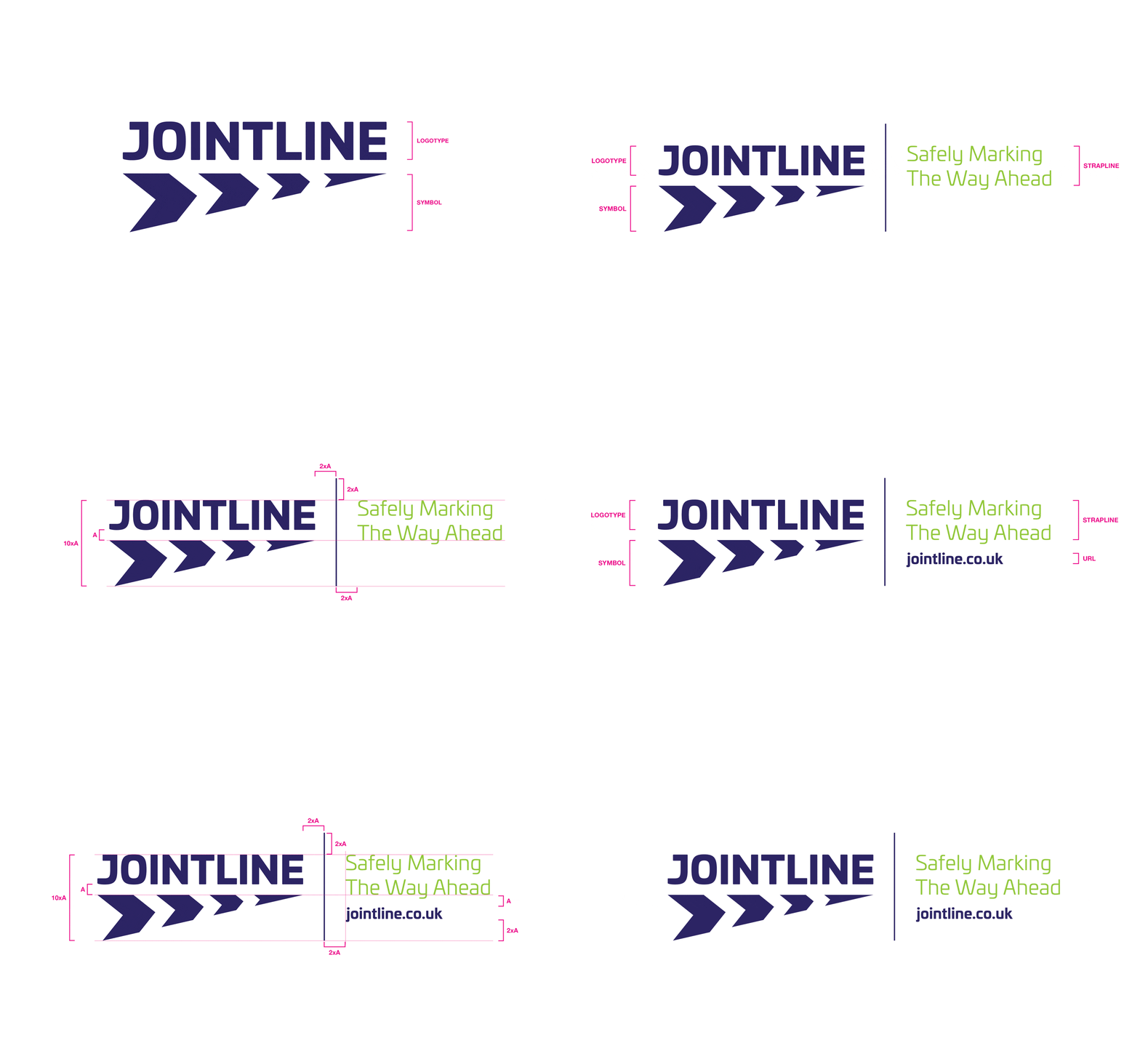
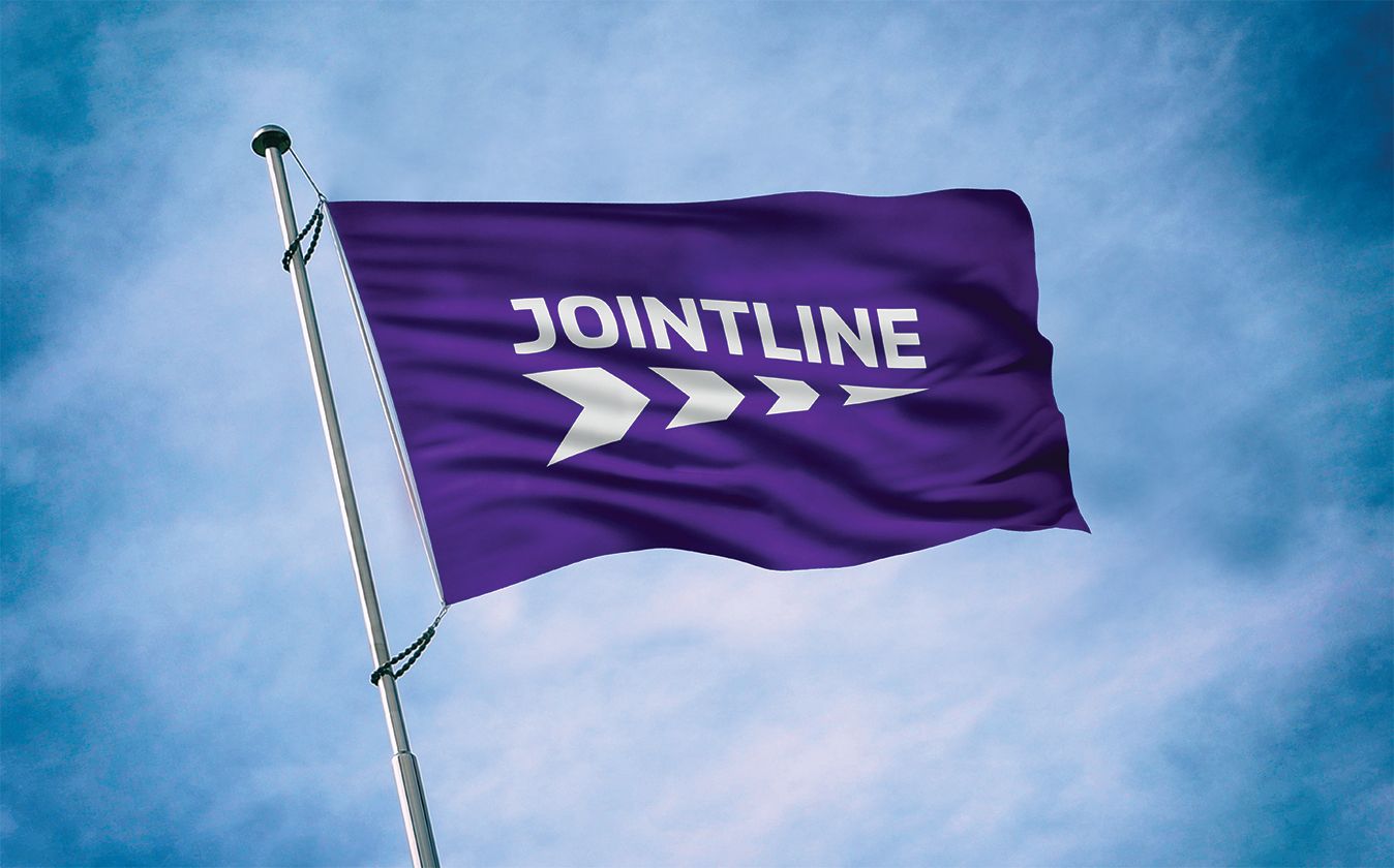
Because of the size of Jointline’s existing road fleet and the relative uniqueness of their existing logo, it was decided that the company’s logo would be an evolution of this – retaining the basic shape of the symbol, adding the chevrons for relevance and visual interest, updating the wordmark and improving the overall composition.
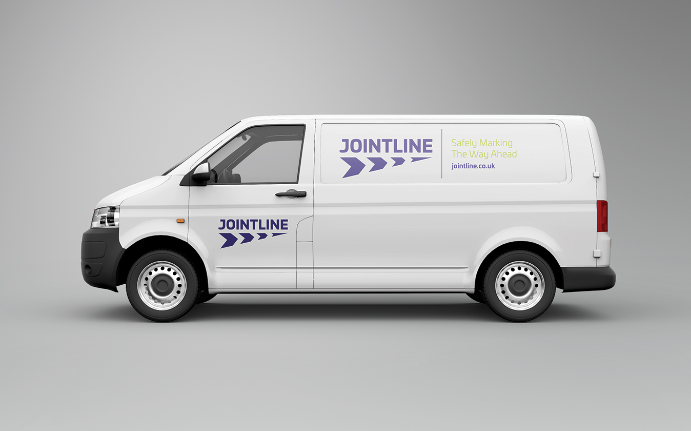
This approach allows the new identity to co-exist with the old where necessary and retains the elements that were essentially good in the first instance.
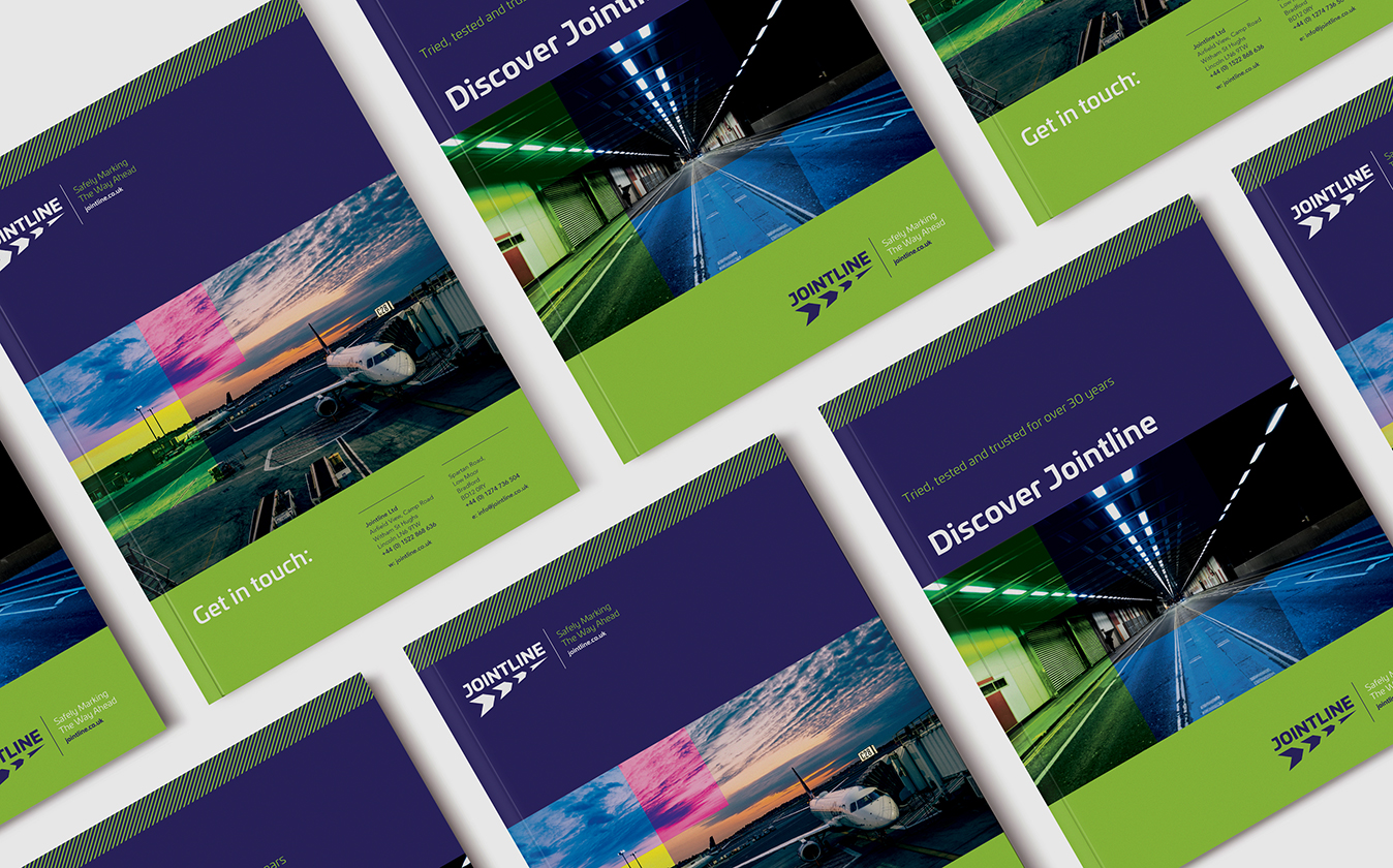
One of the key elements that needed change was the use of colour – throughout the sector, the colours black, white and yellow dominate because they represent the line marking itself. We needed to approach colour and the way it is used differently to create an identity that would stand out.
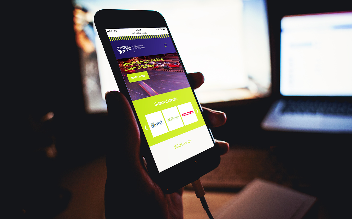
The new Jointline website was also created in-house by POP and integrated with the Expression Engine content management system (CMS), which we are supporting with Google Adwords.

